
Qué Pica!
A self-initiated brand concept built around an existing chile-bird mark: visual system, packaging, a fast casual counter, and a full e-commerce storefront.
Qué Pica is a brand concept built around a logo I already owned. The mark is a chile that also reads as a bird, and it was strong enough that I wanted to find out what a complete brand around it would look like: packaging, a counter, a shop, and the system that holds all of it together.
A lot of branding work starts by changing the logo. This one started by deciding the logo was already right, and that my job was to build something disciplined enough to deserve it. Recognizing a strong visual idea and knowing not to touch it is a design decision too.
The visual system
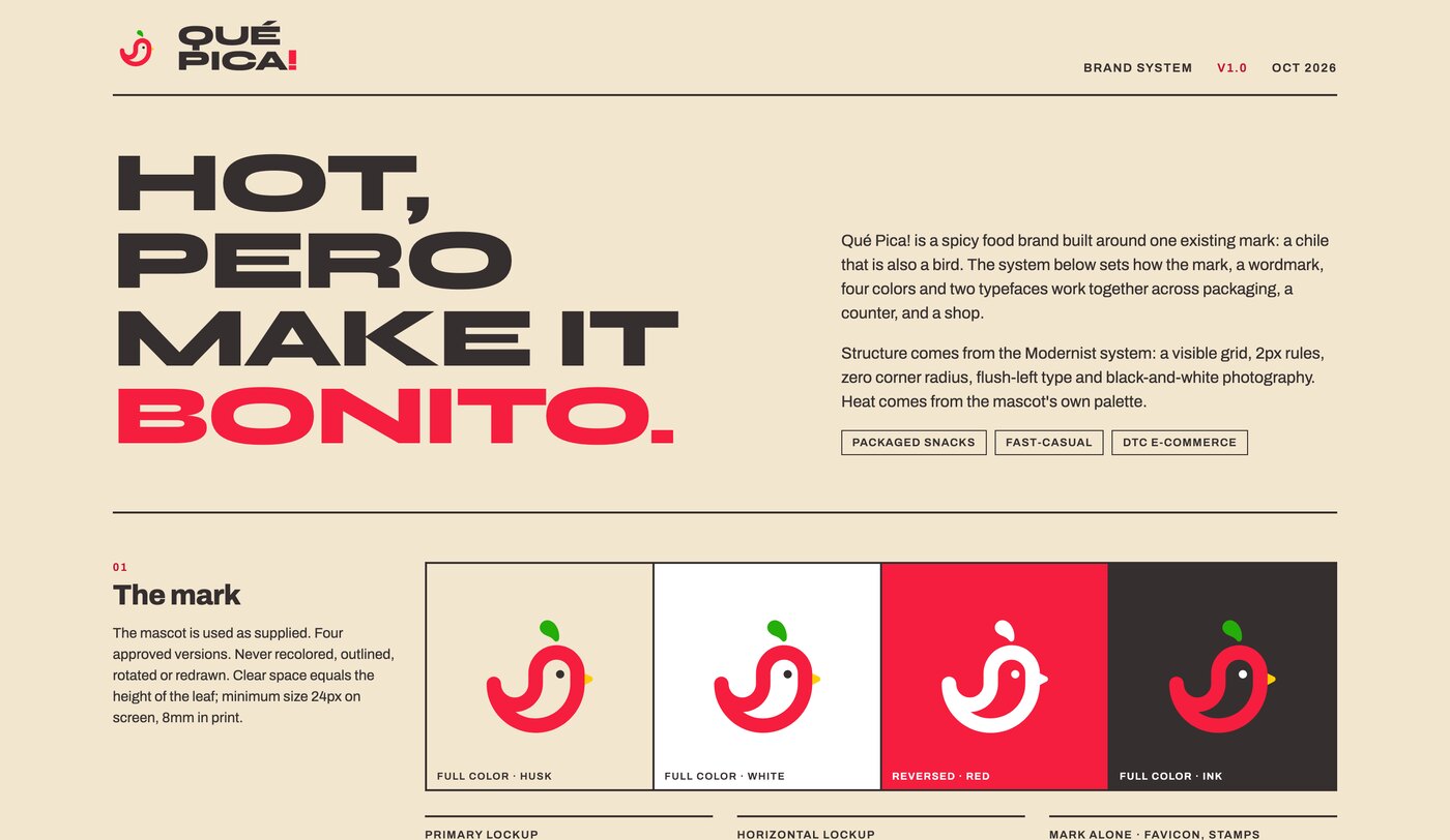
The structure is modernist and deliberately rigid: a visible grid, 2px rules, zero corner radius, flush-left type, and black and white photography. All the heat comes from the mascot’s own palette instead of from decoration.
- Color. Pica Red, Hoja Green, Pico Yellow and Ink on a Husk ground. Every brand color is pulled directly out of the original mark, so nothing on a package is a color the logo does not already contain.
- Type. Syne Extra Bold for the wordmark and the big statements, Archivo for body copy and interface. One voice for shouting, one for explaining.
- Photography. Black and white, always. Food photography is usually pushed warm and saturated, so draining it is what lets the red do all the work.
Packaging
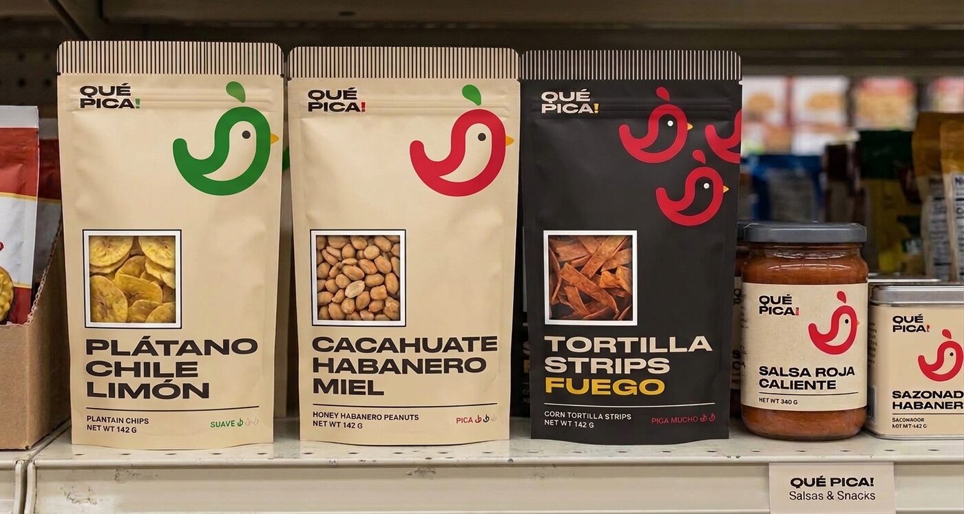
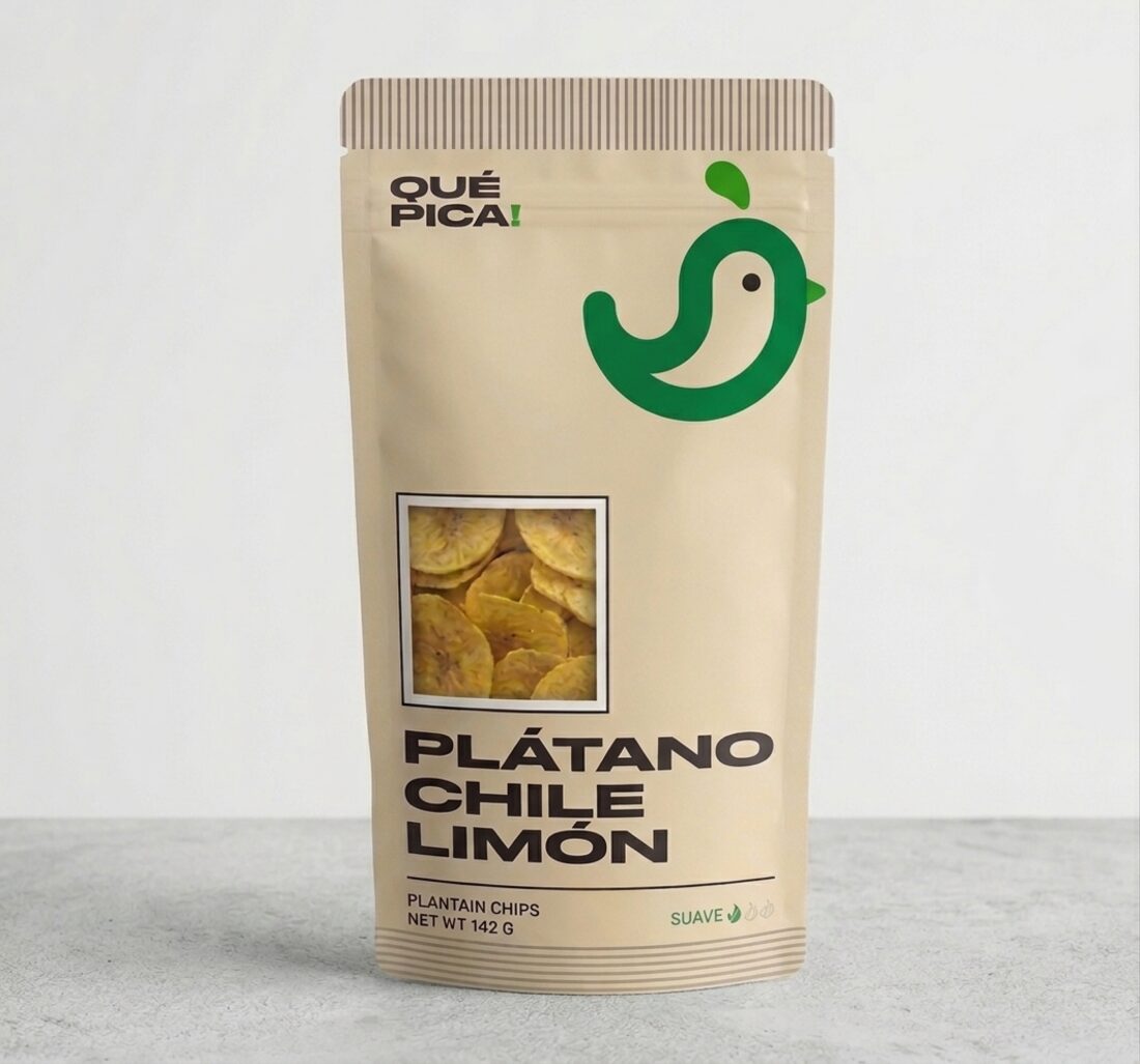
Packaging is where a system either holds or falls apart, so I built the range out far enough to put real pressure on it: plantain chips, chicharrones and corn nuts in the snack line, then hot sauce and seasoning in glass and tin.
The heat scale is the detail I am happiest with. Instead of a number or a generic flame, intensity is shown by repeating the mascot one, two or three times. It uses the asset the brand already has, it needs no translation, and it reads at arm’s length on a shelf.
Taking it off the shelf and into a room
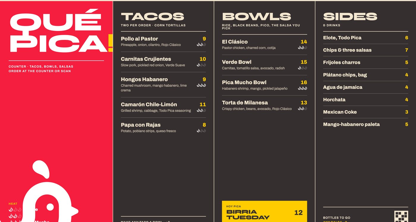
A food brand is not only a package. I pushed the identity into a fast casual counter: the menu board, the signage, the cups and wraps and bags that a customer actually handles.
This is the test that matters. A system that looks correct in a grid of flat artboards often collapses once it has to be legible from across a room, at an angle, under bad lighting. Designing the menu board forced decisions about hierarchy and minimum type size that then fed back into the packaging.
The shop
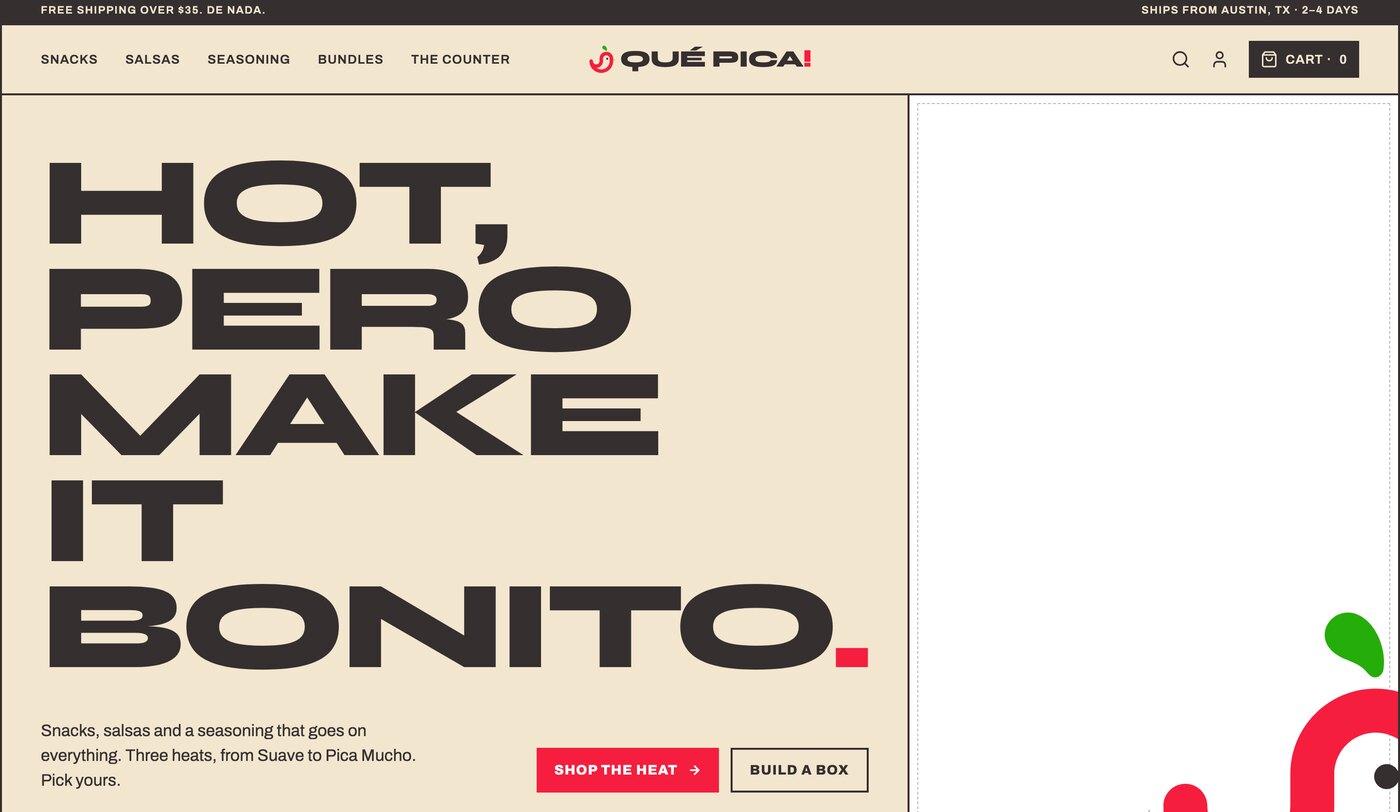
The last piece is where I spend most of my working time: the storefront. I designed and built the e-commerce experience for desktop and mobile, so the brand had to survive contact with real interface problems rather than living only in presentation layouts.
The heat scale became a product filter. The husk ground became the page background. The 2px rules became the component borders, which meant no shadows and no rounded corners anywhere in the UI. Carrying a print-led system into an interface without softening it is harder than it sounds, and it is the reason the shop still looks like the packaging.
What this project shows
Qué Pica is a concept rather than a client engagement, which is exactly why it is useful as a portfolio piece. There was no brief and no committee, so every decision in it is mine and every one of them is defensible.
It covers the span of work I actually do: brand direction, building a visual system, UI and UX, web and e-commerce design, front-end development, and the digital strategy that connects them. What it is not is a claim to be a traditional graphic designer. The illustration was already excellent. The work here is everything that turns one good drawing into a brand a business could launch on Monday.
Original mark by Rahajoe Creativa. Brand direction, visual system, digital experience and development by Nicolas Lule.
See the full experience
Explore the complete presentation for this project.
Explore the brand experience