When working with content management systems like WordPress, Bigcommerce, or Shopify, I often encounter situations where I need to create custom landing pages, banners, or hero images.
In this article, I want to share how easy it is to create a hero image using flex without using any of the popular responsive frameworks like Bootstrap, Foundation, or Semantic.
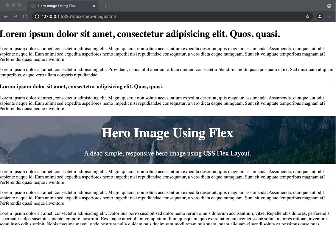
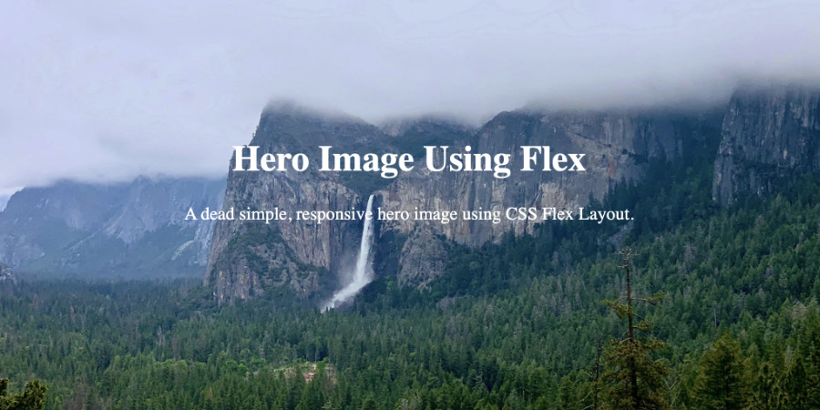
Full-Screen Responsive Hero Image with Flex Layout
The Markup:
<!DOCTYPE html>
<html lang="en">
<head>
    <meta charset="UTF-8">
    <meta name="viewport" content="width=device-width, initial-scale=1.0">
    <link rel="stylesheet" href="custom.css">
    <title>Hero Image Using Flex</title>

</head>
<body>
  <div class="hero">
     <div class="text">
      <h1>Hero Image Using Flex</h1>
      <p>A dead simple, responsive hero image using CSS Flex Layout.</p>
  </div>
  </div>
</body>
</html>
The CSS:
body {
  margin: 0;
}
.hero {
    display: flex;
    flex-direction: column;
    background-image: url("https://nicolaslule.com/wp-content/uploads/hero-image-flex-example-1.jpg");
    height: 100vh;
    align-self: center;
    background-repeat: no-repeat;
    background-size: cover;
    background-attachment: fixed;
    align-items: center;
    justify-content: center;
}

.text {
    font-size: 1.4rem;
    text-align: center;
    color: white;

}
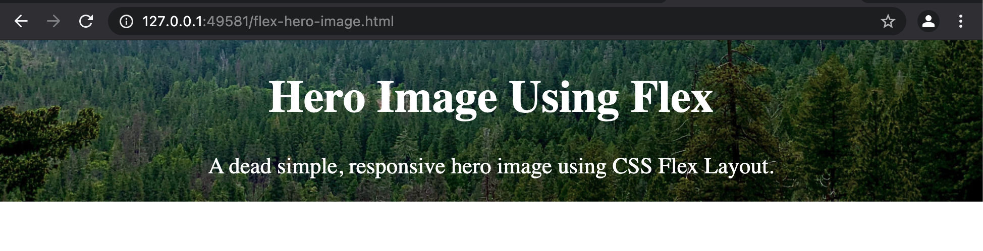
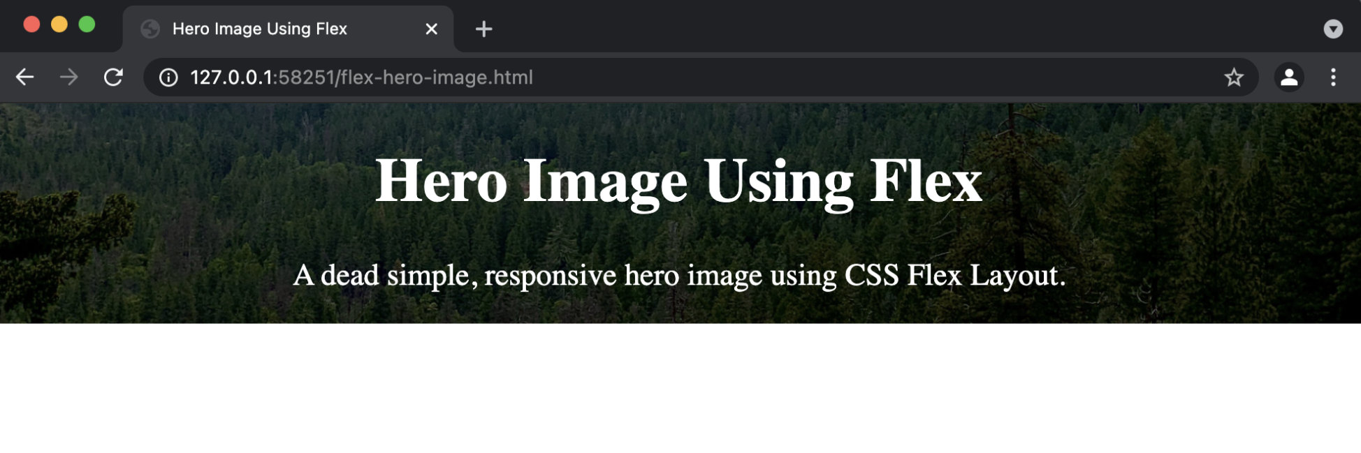
Pure CSS Responsive Hero Image with Flex Layout
Removing the height: 100vh; from our CSS we can make the height of the hero image con be the height of our content.
Adding Dark CSS Gradient to Hero Image
We can make our hero image darker or lighter to make the text more readable by adding a linear-gradient to our background-image CSS property as follows:
.hero {
    display: flex;
    flex-direction: column;
    background-image: linear-gradient(rgba(0, 0, 0, 0.5), rgba(0, 0, 0, 0.5)),
                      url("https://nicolaslule.com/wp-content/uploads/hero-image-flex-example-1.jpg");
    background-position: bottom;
    align-self: center;
    background-repeat: no-repeat;
    background-size: cover;
    align-items: center;
    justify-content: center;
}
Need a lighter hero image gradient? simply change the rgba values of the linear-gradient to a white value.
.hero {
    display: flex;
    flex-direction: column;
    background-image: linear-gradient(rgba(255, 255, 255, 0.5), rgba(255, 255, 255, 0.5)),
                      url("https://nicolaslule.com/wp-content/uploads/hero-image-flex-example-1.jpg");
    background-position: bottom;
    align-self: center;
    background-repeat: no-repeat;
    background-size: cover;
    align-items: center;
    justify-content: center;
}
Flex Hero Image with Parallax
Adding the parallax effect to our flex hero image is very simple. Just add background-attachment: fixed; to the .hero class.
.hero {
    display: flex;
    flex-direction: column;
    background-image: linear-gradient(rgba(255, 255, 255, 0.5), rgba(255, 255, 255, 0.5)),
                      url("https://nicolaslule.com/wp-content/uploads/hero-image-flex-example-1.jpg");
    background-position: bottom;
    align-self: center;
    background-repeat: no-repeat;
    background-size: cover;
    background-attachment: fixed;
    align-items: center;
    justify-content: center;
}
The result: